
Introduction
The rapid evolution of digital technology has drastically reshaped various aspects of education, fundamentally altering how students learn, including their learning outcomes and self-efficacy (Joshi et al., 2025), learning motivations (Zheng et al., 2024), learning cognition (Lin et al., 2025), and engagement within educational environments (e.g., Hutain & Michinov, 2022; Morra et al., 2022). This transformation is particularly significant within vocational education systems, such as in Thailand, where students often require timely, practical access to academic, technical, and administrative information to support skill development and career readiness. In such contexts, digital student handbooks have emerged as essential tools that provide streamlined access to course catalogs, institutional policies, critical deadlines, and procedural guidelines. However,the effective design of these tools necessitatesa profound understanding of the users' needs, preferences, and behaviors.
This study adopts a User-Centered Design (UCD) framework as its guiding approach to ensure that the digital handbook is not only technologically sound but also pedagogically and contextually appropriate. UCD emphasizes designing with and for users by involving them at every stage of development (Norman, 2013). Specifically, this study applies UCD principles such as (1) early focus on users and their tasks, (2) empirical measurement through user testing, (3) iterative design based on feedback, and (4) involving users in the design process to enhance usability and relevance (Gulliksen et al., 2003). By incorporating UCD into the development of digital handbooks tailored to Thai vocational education, this research aims to improve accessibility, navigation, and engagement, particularly for students who may face unique institutional and technological challenges.
As higher education institutions continue to embrace digital transformation, embedding user-centered methodologies becomes increasingly critical to ensuring inclusivity, effectiveness, and learner satisfaction (Ait Ounejjar et al., 2024; Gharaei et al., 2024). This study, therefore, not only seeks to develop a functional and intuitive digital student handbook but also contributes to a growing body of work on digitalequity and learner-centered innovation in vocational education.
One of the primary challenges in designing such digital tools is ensuring they accommodate the varied needs and preferences of students. User-Centered Design (UCD)provides an invaluable starting pointfor developing digital tools that prioritize users' needs, behaviors, and goals throughout the entire development process (Prince et al., 2025; Saitong, 2022). UCD focuses on engaging users at every stage of design to ensure the final product aligns with their expectations and addresses their pain points (Armour et al., 2025; Marelli et al., 2024). When UCD principles are applied in the creation of a digital student handbook, the result is an accessible, intuitive, and engaging tool that not only offers critical information but also enhances the overall user experience (Bucher et al., 2024; Berger et al., 2024;Tongsubanan & Kasemsarn, 2024).
The ability of digital tools to improve students' access to vital information and services underscores their growing role in education.Digital handbooks have become highly popular alternatives to traditional printed materials, offering real-time access to academic and administrative content, thereby enhancing communication between students and institutions (Soehnchen et al., 2024). The integration of UCD principles into the design of digital platforms, such as student handbooks, has been shown to significantly improve usability and student satisfaction (Zhu et al., 2024).However, there are challenges associated with implementing UCD principles.Researchers (e.g., Jumbo-Lucioni et al., 2023; Townley & Koop, 2024) highlight the difficulty in gathering diverse user feedback and ensuring that the design process accurately represents the needs of all stakeholders, including students, faculty, and administrative staff.
In response to these challenges, recent advancements in data collection techniques, such asweb scraping and text mining, have been proposed as effective methods for gathering comprehensive and accurate user feedback (Carreiro et al., 2024). These methods enable designers to identify patterns in user behavior and preferences that may not be captured through traditional feedback mechanisms, providing valuable insights into how digital tools can be optimized for broader accessibility and engagement (Jameson et al., 2022; Jumbo-Lucioni et al., 2023; Levy & Hadar, 2024). Despite the wealth of literature on digital tools in education and UCD, a significant gap remains in research focused specifically on the development of digital student handbooks that utilize UCD principles (Weisberg & Dawson, 2024).
By addressing these gaps, this study aims tooffer helpful advice abouthow higher education institutions can develop effective digital student handbooks that cater to students' needs while fostering engagement and enhancing the overall educational experience.The primary objective of this research is to explore how the UCD framework can be applied in designing and developing a digital student handbook prototype that is both intuitive and efficient, ultimately meeting the needs of the student population in higher education (Shah et al., 2024).Specifically, this study (a) analyzed the challenges and limitations of traditional student handbooks and existing digital solutions in higher education, (b) developed a prototype for a digital student handbook that prioritizes usability and accessibility, and (c) evaluated the effectiveness of the prototype, identifying areas for improvement and confirming that the application successfully prioritizes usability and accessibility.
As higher education institutions continue to adopt digital solutions, it is crucial that tools like digital student handbooks be developed with students' needs and preferences in mind. By integrating UCD principles and employing innovative data collection techniques, educational institutions can create digital handbooks that not only enhance the student experience but also contribute to academic success (Zakir & Imtiaz, 2024).
Several studies have explored the significance of UCD in the development of educational tools. For example, Weinhandl et al. (2024) demonstrated how user-centered educational design could enhance the experience of mathematics students by developing personas that align with user needs, a similar approach that could be applied to student handbooks. Meanwhile, Tinmaz and Dhillon (2024) highlighted the importance of cognitive walkthroughs in creating user-centric avatars for virtual education, further emphasizing how understanding user behavior can improve educational tools. Similarly, Arafat et al. (2024) investigated the harmonization of design with user requirements for university buildings, showcasing the broader application of UCD in various educational settings.
Moreover, Zhao et al. (2024) examined the use of database methods to uncover user data, further supporting the idea that understanding user behavior through technology can significantly enhance educational design. In the context of digital tools, Kealey et al. (2023) assessed how user experience design can improve printed educational materials, which may have parallels in enhancing the digital student handbook experience. These studies demonstrate the ongoing relevance and applicability of UCD in educational design, providing a foundation for developing digital student handbooks that effectively and efficiently meet student needs.
In response to the growing role of digital tools in education, this study acknowledges both the advantages and the design challenges associated with digital student handbooks. To address these challenges, the research adopts a User-Centered Design (UCD) approach as a systematic framework to ensure that the final product aligns with the diverse needs and preferences of students. The study aims to develop a prototype that not only applies UCD principles but also prioritizes usability and accessibility. By critically examining the limitations of traditional paper-based handbooks and existing digital alternatives, this research aims to develop a more inclusive and effective digital solution that enhances the overall student experience in higher education. The specific research methods used to achieve this objective are detailed in the following section.
The increasing shift toward digitalization in higher education has prompted institutions to replace traditional paper-based student handbooks with digital alternatives. While digital handbooks offer advantages such as real-time updates, ease of access, and integration with institutional systems, their effectiveness is often hindered by poor usability, limited personalization, and a lack of accessibility features. These issues can significantly impact students' ability to identify and use critical academic information,especiallythose with diverse needs and learning preferences.
Despite growing interest in digital platforms and the recognized value of user-centered design (UCD) in educational technology, there remains a clear research gap: few studies have systematically applied UCD principles to the design and development of digital student handbooks. Existing research tends to focus broadly on digital learning environments or interface design,butrarely addresses the specific structural, functional, and experiential demands of student handbooks within higher education.
To address this gap, this study aims to design, develop, and evaluate a digital student handbook prototype based on UCD principles, with a focus on improving usability, accessibility, and overall user satisfaction.
To address this aim, the study investigates the following research questions:
What challenges do users face with current student handbook formats in higher education?
How can UCD principles inform the development of a digital handbook that addresses these challenges?
How do users evaluate the prototype in terms of design, functionality, and satisfaction?
This research contributes a replicable design model for institutions seeking more inclusive, efficient, and student-centered digital tools.
By addressing these questions, the study contributes to both the theoretical understanding and practical application of UCD in educational support tools. It offers a replicable framework for institutions seeking to enhance student engagement and access to academic information through digital innovation.
By combining UCD with innovative data collection techniques—such as clustering analysis to uncover design preferences—this study contributes to both academic understanding and practical development of inclusive, responsive digital tools for students. Specifically, the study aims to:
Analyze the challenges and limitations of traditional and current digital student handbooks in higher education.
Develop a digital prototype guided by usability and accessibility principles; and
Evaluate the prototype’s effectiveness and identify areas for refinement.
Through this work, the research offers a practical framework for institutions seeking to improve student support systems while advancing UCD scholarship applications in educational settings.
Methodology
Research Design
This study employed a mixed-method research design to ensure methodological rigor through triangulation, facilitating cross-validation of findings. The research focused on the development and evaluation of a digital student handbook prototype for Surin Vocational College, with potential scalability to 432 vocational institutions across Thailand. The prototype was designed as a strategic educational tool to enhance students’ career readiness by offering accessible information on internships, job opportunities, workplace ethics, and labor market trends. In doing so, it aligns vocational education with national workforce development goals while promoting professional competencies, technological literacy, and lifelong learning.
Sample and Data Collection
The study sample comprised 353 students and 63 faculty members,drawn from a total population of 2,949 students and 75 faculty at the institution. Yamane’s formula (1967) was employed to determine an appropriate sample size with a 95% confidence level and a 5% margin of error, ensuring statistical validity. A stratified random sampling method was used to enhance representativeness by proportionally including participants from different academic years (for students) and faculty departments (for staff). The target response rate was set at 80%, with follow-up reminders sent to maximize participation and reduce nonresponse bias.
Data collection was conducted through a multi-phase approach over a period of six months, structured in three sequential stages:
This study employed a three-phase sequential mixed-methods research design incorporating exploratory interviews, prototype development with iterative user testing, and a final evaluation using structured instruments.
Phase 1: Exploratory Interviews (Months 1–2)
Group interviews were conducted with 30 students and 10 faculty members using semi-structured interview guides focused on their experiences with both paper-based and digital student handbooks. Sample questions included:
“What challenges do you face when using the current student handbook?”
“How easy is it tolocatekey information (e.g., policies, course details)?”
Thematic analysis of the responses identified key issues such as poor accessibility, limited personalization, outdated information, lack of platform compatibility, and inadequate support for students with disabilities. Findings from this phase informed the prototype design criteria.
Phase 2: Prototype Development and Iteration (Months 3–4)
The digital student handbook prototype was developed following user-centered design (UCD) principles and comprised the following key stages:
1.Wireframe Design:
Initial low-fidelity wireframes were created using Figma, focusing on content layout, navigational structure, and mobile responsiveness.
2.Prototype Creation:
These wireframes were developed into interactive, high-fidelity clickable prototypes within Figma, simulating a realistic user experience across devices (desktop, tablet,andmobile).
3.Usability Testing – Round 1:
A pilot group of 20 students participated in moderated usability testing. Tasks were assigned (e.g., locatingtheacademic calendar,andaccessing contact information), and user interactions were observed. Participants completed post-task reflection forms to record challenges and impressions.
4.Design Iteration 1:
Feedback from Round 1 led to refinements in visual hierarchy, icon placement, and menu logic. Accessibility features (e.g., font size adjustments, contrast ratio) were also enhanced based on feedback.
5.Usability Testing – Round 2:
A second group of 20 students engaged with the updated prototype. This round emphasized efficiency and error recovery in task completion. Observations and user reflections were analyzed to assess improvements in usability and accessibility.
6.Final Refinement:
Cumulative feedback from both rounds informed the final prototype. Adjustments focused on streamlining information flow, improving content clarity, and optimizing cross-platform performance.
This structured, iterative process ensured that user input directly shaped the evolution of the prototype and verified its usability and accessibility objectives.
Phase 3: Systematic Evaluation (Months 5–6)
The refined prototype was evaluated using structured instruments with a larger sample of 353 students and 63 faculty members. Three validated instruments were used:
1.Design Evaluation Questionnaire (DEQ)
Purpose:Assess structure, content organization, and information hierarchy.
Sample Items:“Information categories are logically organized” (Likert scale: 1 = Strongly Disagree to 5 = Strongly Agree).
Reliability:Cronbach’s alpha = 0.89.
2. User Experience (UX) Evaluation Survey
Dimensions:Usability, visual appeal, content flow, ease of use, and overall user satisfaction.
Sample Items:
“The interface issimpleto navigate.”
“I can find the information I need quickly.”
Scale:5-point Likert scale.
Validation:Adapted from prior UX research (e.g., Lewis, 2018); Cronbach’s alpha = .91.
3. User Interface (UI) Evaluation Checklist
Focus:Layout design, typography, color contrast, readability, and responsiveness.
Format:20-item checklist completed by design experts and users.
Scoring:Binary (0 = Needs improvement, 1 = Satisfactory), with qualitative comments.
Task-based usability testing was also conducted. Participants were asked to complete five standard information-retrieval tasks (e.g., “Locate academic calendar,” “Find course prerequisites”) while researchers measured success rates and task completion times.
Data Analysis and Validation
Data analysis combined both quantitative and qualitative methods to capture comprehensive user insights. Quantitative survey data were analyzed using descriptive and inferential statisticsand reliability testing, while qualitative datawereanalyzed thematically to extract usability issues and improvement areasfrom interviews and focus groups, whichwere thematically coded to identify recurring patterns.These findings validated the prototype’s effectiveness and informed final recommendations for institutional adoption.Findings were organized into five core categories: information needs, desired features, preferred usage, additional suggestions, and integration with institutional systems—forming the basis of a user experience (UX) analysis to inform iterative design improvements.
To ensure the reliability and validity of the research instruments, a multi-step validation process was employed:
· Content Validity: The initial questionnaire and interview protocols were reviewed by five experts—including two specialists in educational technology, one UX designer, one accessibility consultant, and one vocational education expert. These experts assessed the content for relevance, clarity, and coverage of key dimensions (e.g., functionality, accessibility, personalization, and usability). The Item-Objective Congruence (IOC) index was calculated, with all items scoring between 0.80 and 1.00, indicating strong content relevance and clarity.
· Construct Validity: Constructs were derived from a synthesis of the literature on digital learning tools and student information systems and then confirmed throughExploratory Factor Analysis(EFA) conducted during the pilot phase (n = 50). The factor structure was aligned with the intended categories (e.g., usability, access, and content clarity), supporting the instrument’s construct validity.
Reliability:Internal consistency of thequestionnaire on student usability perception—which comprised three subscales:navigation and design,content clarity, andoverall satisfaction—was assessed using Cronbach’s alpha. The alpha values were as follows:
Navigation and Design: α = .079
Content Clarity: α = .076
Overall Satisfaction: α = .078
These values indicate acceptable tosatisfactoryreliability across subscales. In addition, test-retest reliability was evaluated with a subgroup of 30 participants over a two-week interval, yielding a correlation coefficient ofr= .081,suggesting strong temporal stability of the instrument.
This rigorous validation process ensured that the instruments were both psychometrically sound and contextually appropriate for assessing student and faculty experiences with digital student handbooks in the Thai vocational education context.
Findings/Results
Objective 1: Critically Assess Limitations of Traditional and Existing Digital Handbooks
Theprimary objective of this study is to critically evaluate the limitations of both traditional paper-based student handbooks and existing digital alternatives within the context of higher education. The analysis is framed through the lens of user experience, focusing on how these shortcomings hinder students’ ability to access andeffectively utilize essential academic information.
Limitations of Traditional Paper-Based Student Handbooks
Although traditional student handbooks have historically played a vital role in disseminating academic information, they are increasingly inadequate in contemporary educational settings. Key limitations include restricted accessibility, particularly for off-campus students, and the lack of personalized content tailored to individual academic pathways. The process of updating physical handbooks is inefficient, often resulting in the distribution of outdated information due to the delays inherent in reprinting. Additionally, the unstructured and text-heavy format of paper handbooks impedesefficient navigation and quick retrieval of information. Environmental concerns, such as paper waste,and practical issues of portability,further diminish their relevance. Collectively, these limitationshighlight the need for more adaptable and accessible digital solutionsto support the evolving needs of modern learners.
Limitations of Existing Digital Solutions
Despite offering a modern alternative to traditional formats, existing digital platforms—including PDFs, institutional websites, and mobile applications—exhibit significant functional and structural limitations. Many digital handbooks retain the rigid, non-interactive structure of paper-based versions, lacking responsive design and intuitive navigation, which hinders user engagement and efficient information access. The absence of personalized content further limits their effectiveness in supporting individualized academic experiences.
A major concern is the lack of accessibility and inclusivity, particularly for students with disabilities, as many platformsfail to meet theWeb Content Accessibility Guidelines (WCAG) or support assistive technologies. Additional technical deficiencies include device and browser incompatibility, slow loading times, broken links, and inadequate data security, all of which compromise usability and user trust. Furthermore, the lack of integration with institutional systems such as Learning Management Systems (LMS) and registration services results in fragmented and inefficient user experiences. These limitations collectivelyhighlightthe urgent need for a user-centric digital solution that is interactive, accessible, secure, and seamlessly integrated into the broader educational infrastructure.
In response to these persistent challenges, the study advances from diagnostic analysis to solution development. By applying a user-centered design framework, the next phase aims to translate identified user needs and institutional gaps into a functional, inclusive, and adaptable digital tool.
Objective 2: Develop a Prototype Grounded in User-Centered Design Principles
The second objective centers on the development of a prototype for a digital student handbook, grounded in user-centered design (UCD) principles, to address the previously identified limitations. The prototype prioritizes usability, accessibility, and responsiveness across devices and platforms.
User Experience (UX) Analysis
The UX analysis yielded five key findings:
Information Prioritization:Students identified key areas of interest, including academic programs, course structures, regulatory frameworks, Ministry of Education policies, and student welfare services.
Desired Services:Participants expressed strong interest in functional services, includingacademic results, course registration, financial aid, tuition payments, study plans, and administrative requests (e.g., ID cards, leave applications).
Content Presentation Preferences:Users preferred concise summaries supported by visual elements, readable text, and interactive features like Q&A chat systems to enhance navigability.
Design and Functionality Suggestions:Participants recommended a lightweight application accessible to both students and parents, with supplemental resources such as YouTube guides. Aesthetic preferences included student-friendly colors and a visually engaging interface.
System Integration:Participants emphasized the importance of synchronizing the handbook with institutional systems to streamline access to personalized and real-time academic data.
These insights directly inform the functional and aesthetic design of the digital student handbook prototype, ensuring that it meetsthe diverse needs of students, supports inclusivity, and enhances the overall academic experience.
Analysis of the User Experience (UX)
Table 1 summarizes the analysis of the User Interface (UI) for the digital student handbook application.
Table 1. User Interface (UI) Design Preferences for the Student Handbook Application
| No | Item | No. of respondents | Percentage | |
| 1. | Visual Design | Shape of the Button | ||
| Text-based Style or Text-only Style | 7 | 11.1 | ||
| 3D Text-based Style | 9 | 14.3 | ||
| Rectangular Style | 2 | 3.2 | ||
| 3D Rectangular Style | 3 | 4.8 | ||
| Rounded Rectangle Style | 7 | 11.1 | ||
| 3D Rounded Rectangle Style | 35 | 55.6 | ||
| Total | 63 | 100 | ||
| Object shape | ||||
| Using light and shadow to add depth | 45 | 71.4 | ||
| Not using light and shadow to add depth | 18 | 28.6 | ||
| Total | 63 | 100 | ||
| 2. | Colors | Blue-Yellow Tone | 12 | 19 |
| Blue- Purple Tone | 23 | 36.5 | ||
| Yellow- Brown Tone | 1 | 1.6 | ||
| Blue-Grey Tone | 14 | 22.2 | ||
| Yellow- Purple Tone | 5 | 7.9 | ||
| Blue-Pink Tone | 8 | 12.7 | ||
| Total | 63 | 100 | ||
| 3. | Whitespace | Consistent Spacing or Uniform Spacing | 12 | 19.1 |
| Alternating Spacing | 7 | 11.1 | ||
| Rounded Corners with Consistent Spacing | 44 | 69.8 | ||
| Total | 63 | 100 | ||
| 4. | Layouts | Graphic-Heavy Style | 25 | 39.7 |
| Image-Focused Style | 28 | 44.4 | ||
| Text and Icon-Focused Style | 10 | 15.9 | ||
| Total | 63 | 100 | ||
| 5. | Typography | Formal Header Style | 34 | 54 |
| No Formal Header Style | 9 | 14.3 | ||
| Informal Header Style | 9 | 14.3 | ||
| No Informal Header Style | 11 | 17.5 | ||
| Total | 63 | 100 | ||
| 6. | Language | Thai | 63 | 100 |
| English | 0 | 0 | ||
| Total | 63 | 100 |
Table 1 outlines key UI preferences from a survey of 63 participants, revealing critical user expectations regarding visual style, layout, and accessibility. A strong preference for modern, three-dimensional UI elements emerged, with 55.6% favoring 3D rounded rectangle buttons and 71.4% indicating a preference for depth-enhancing light and shadow effects. These findings suggestthat users desire interfaces that offer not only visual appeal but also a sense of interactivity and tactility, which are essential formaintaining user engagement in digital environments.
In terms of color preferences, blue-purple tones were most popular (36.5%), which aligns with color psychology,suggesting such hues are perceived as trustworthy, calming, and professional—traits well-suited to academic applications. Conversely, yellow-brown tones were the least preferred (1.6%), likely due to their association with visual fatigue and lower aesthetic appeal.
Layout preferences leaned heavily toward clarity and comfort, with 69.8% of users preferring rounded corners and well-spaced components, signaling the importance of readability and cognitive ease. Additionally, image-focused and graphic-rich designs were rated higher thanthose dominated by icons or text, suggesting that users value visual storytelling and theintuitive communication of information.
Typography also reflected a strong preference for formality and readability. With 54% of users preferring formal header styles, it was evident that students expected a professional and structured look appropriate for academic content.Notably, 100% of respondents selected Thai as their preferred application language, highlighting the crucial role of localization in enhancinguser engagement and comprehension.
In response to these multifaceted challenges, the studydevelopsan innovative solution grounded in user-centered design principles. This transition from diagnostic analysis to design intervention marks a critical step toward addressing the usability and accessibility gaps identified in existing platforms.
Design Implications and Integration
These preferences directly shaped the application’s UI design. The use of blue-purple tones was prioritized,striking a balance between institutional branding anduser appeal. Rounded buttons and shadow effects were incorporated to enhance touch-based interaction, and visual hierarchy was supported with formal typographic styles. The feedbackinformed the decision to utilize visually rich layouts, enhancingnavigability and content absorption. Moreover, full localization into Thai ensured linguistic accessibility and demonstrated cultural responsiveness—crucial for adoption within the local educational context.
These findings directly informed the UI design process, ensuring the application aligns with user expectations for usability, cultural relevance, and visual appeal. This section also shows how we used User-Centered Design (UCD) principles, which involved two main steps: (1) gathering user preference data with K-means clustering and (2) creating the prototype with a strong emphasis on usability and accessibility.
Extracting Necessary Data Using K-means Clustering
To ensure the prototype aligns with user expectations, K-means clustering was employed as an unsupervised machine learning techniqueto segmentuser preference data into meaningful clusters. This method was appropriate for identifying patterns in high-dimensional data (e.g., font style, color palette, and layout preferences) without predefined labels, allowing us to uncover natural groupings within the dataset.
Specifically, K-means clustering was applied to survey responses (n = 353 students) on visual design preferences, using Euclidean distance as the similarity measure. We tested different values of k and selected the optimal number of clustersusing the elbow method, which revealed that three distinct preference profiles providedthe best fit for the data.
The recall values referenced in Table 2 were calculated as part of a post-hoc evaluation step. After initial clustering, we validated the consistency of user preference segments by measuring how well the clusters predicted actual choices made by a subset of users during usability testing. Recall was computed as the proportion of users whose observed selections during prototype interaction matched the predicted cluster-based profile preferences.
These clustered insights directly informed the visual and navigational elements of the prototype, ensuringthe interface was culturally relevant, accessible, and aligned with user expectations.
Table 2.Results of K-means Clustering for Font and Color Theme Preferences
| Factors Evaluated | Number of sentences in each cluster | True Positive (TP) value | False Negative (FN) | Recall |
| Data for determining the font | 785 | 657 | 126 | 0.84 |
| Data for determining the color theme | 756 | 643 | 113 | 0.85 |
Table 2 presents the outcomes of applying K-means clustering to analyze user preferences for font and color themes, serving as a foundation for digital student handbook design. For font preference determination, 785 sentences were analyzed, yielding a recall rate of 84%, with 657 correctly classified (true positives) and 126 misclassified (false negatives). For color theme preference, 756 sentences were evaluated, resulting in a recall rate of 85%, with 643 correctly classified and 113 misclassified. These high recall values indicate strong model performance and effective classification accuracy.
The clustering results yield vital information about user design preferences, which directly informed usability-focused development of the digital student handbook prototype. By aligning design elements with user expectations, the process ensured the final application would be both intuitive anduser-centered.
Designing and Developing the Digital Student Handbook Prototype with a Focus on Usability
This sectionoutlines the application of user-centered design (UCD) principles in the development of a digital student handbook prototype, with a focus onusability and alignment with user needs. Drawingon insights gained in Phase One (User Experience Design), the development process advances toPhase Two (User Interface Design), where these insights are translated into a functional and visually coherent interface.
Phase One: User Experience Design (UXD)
The UX design phase involves two primary steps:
Research and Planning: This step includes the construction of user personas based on interviews andthecategorization of user needs. It integrates customer experience (CX) methodologies to extract key behavioral and experiential insights.
Sketching the User Journey: The user flow is mapped, starting from the splash screen through account creation to a product tour, ensuring a logical and intuitive interaction pathway.
The user journey encompasses key engagement stages:
Awareness: Introducing the application and its educational services.
Evaluation: Encouraging users to explore the app.
Purchase/Usage: Motivating continued engagement.
Repurchase and Advocacy:Fostering user satisfaction, repeat use, and positive word-of-mouth promotion.
Key design considerations included:
Stages and Journey Mapping:Visualizing the full user path.
Touchpoints: Ensuring accessibility across both online and offline platforms.
Target Audience (Gen Z): Prioritizing modern, functional features aligned with users’ cognitive (thinking) and emotional (feeling) expectations.
Pain Points: Identifying and resolving user challenges to ensure a seamless, satisfying experience.
Phase Two: User Interface (UI) Design and Development
This phase marks the transition from conceptualization to practical implementation:
Step One: Sketching the User Interface on Paper.
Initial interface designs are drafted manually, focusing on clear layout, visual balance, and intuitive navigation. This stage lays the groundwork for developing an aesthetically pleasing and user-friendly digital application.
Overall, this two-phase approach ensures that the digital student handbook prototype is not only functional and responsive but also tailored to the preferences, behaviors, and expectations of its intended users.
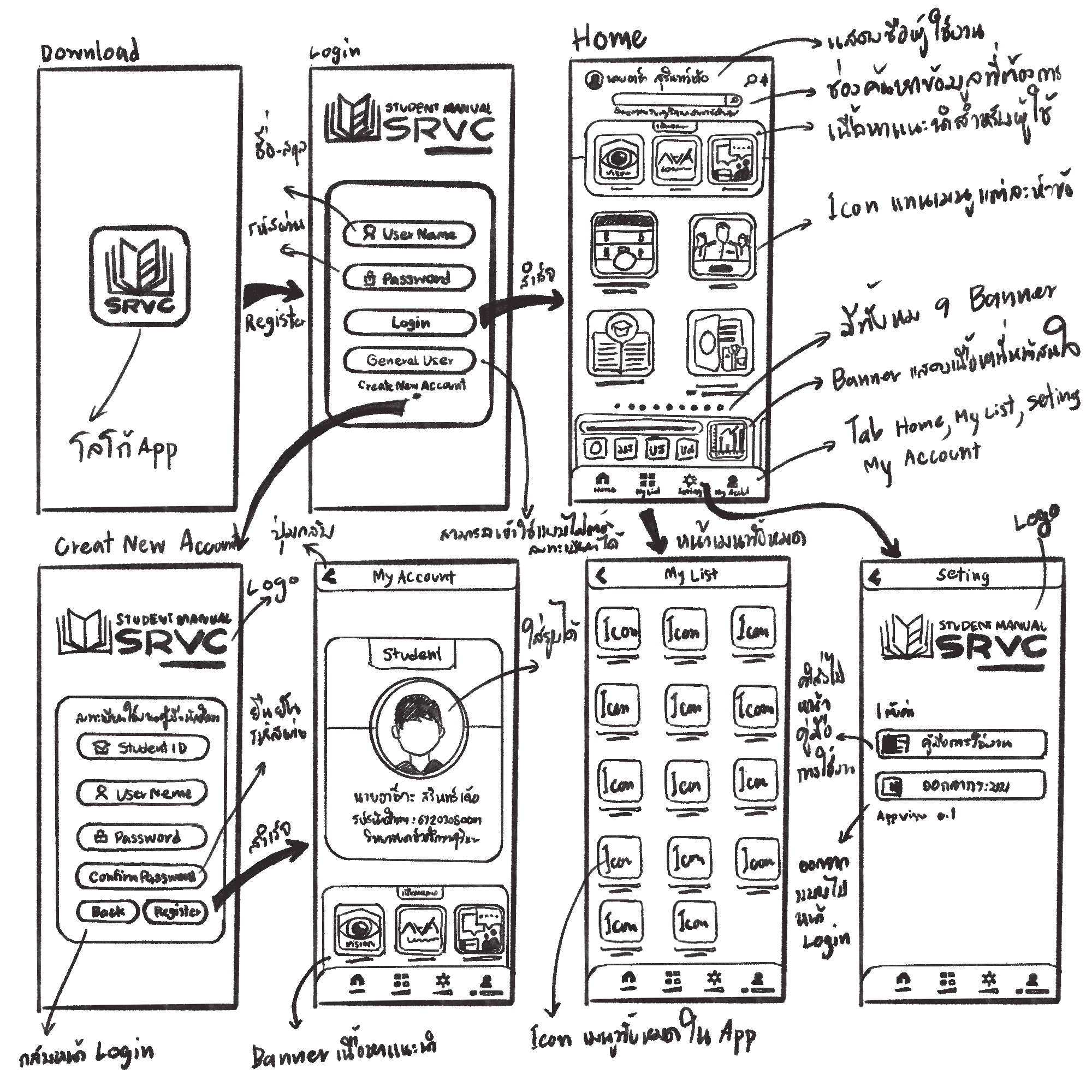
Figure 1.Design Sketch
Step Two: Developing the User Interface Draft in Figma
The sketch created on paper was then transferred to Figma, a design software, where the components are further arranged and fine-tuned. This stage also involves testing the ease of use and designing the links between various sections of the system.
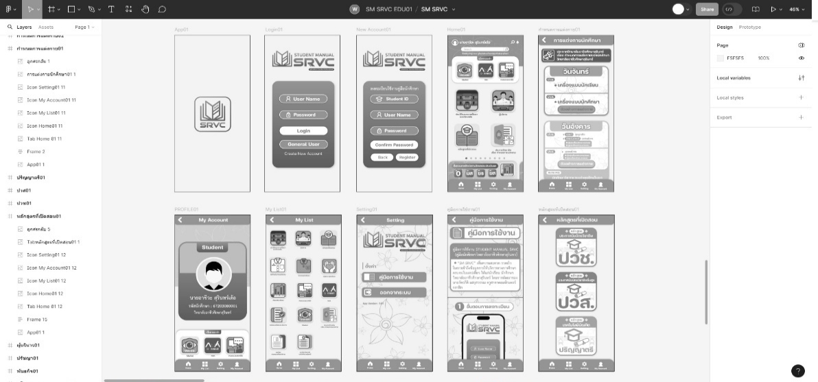
Figure 2. User Interface Draft in Figma
Step Three: Finalizing the Mood and Color Scheme for the App Interface
The mood and overall color tone used in the app’s interface are aligned to ensure consistency. Thisassignmentis done using the findings from the student user experience design survey conducted at the vocational college.
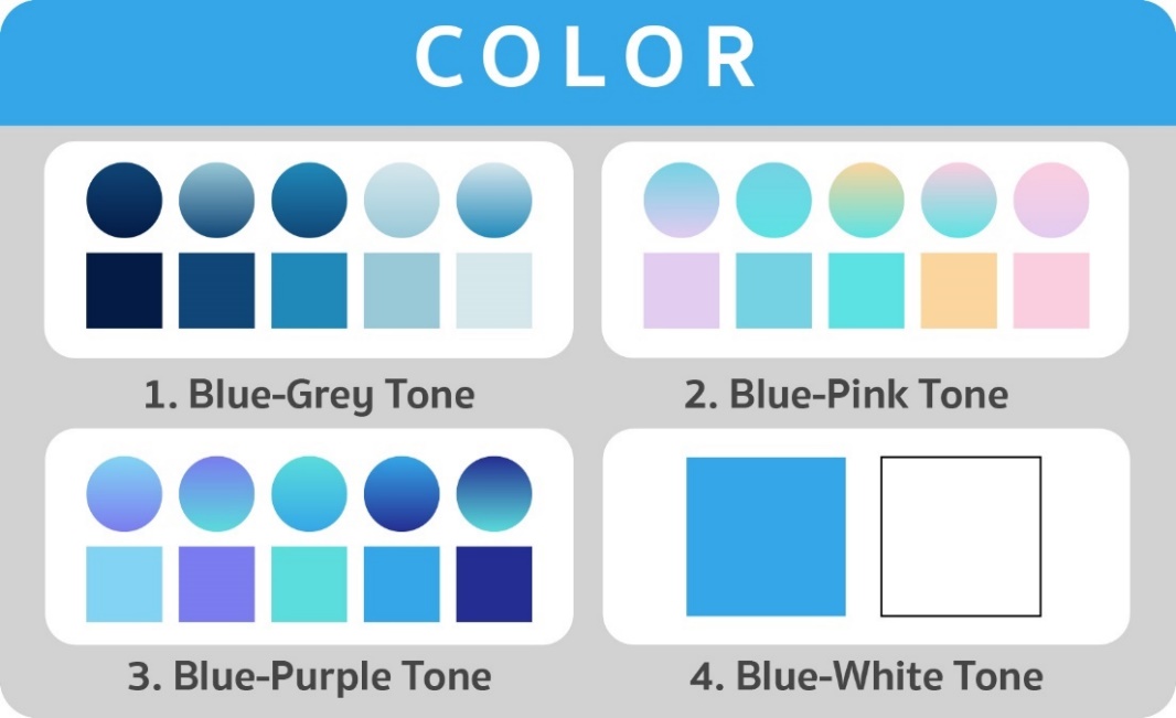
Figure 3. The Mood and Color Tone Preferences for the App Design
Figure 3 shows the mood and color tone preferences for the app design based on the student user experience survey. The preferences are ranked from most to least as follows:blue-grey tone, blue-pink tone, and blue-purple tone. Theblue-white tone, being the institutional color, is suitable for representing the institution's identity.
The following are the mood and color tones used in the application, derived from guidelines for designing color schemes for mobile applications.
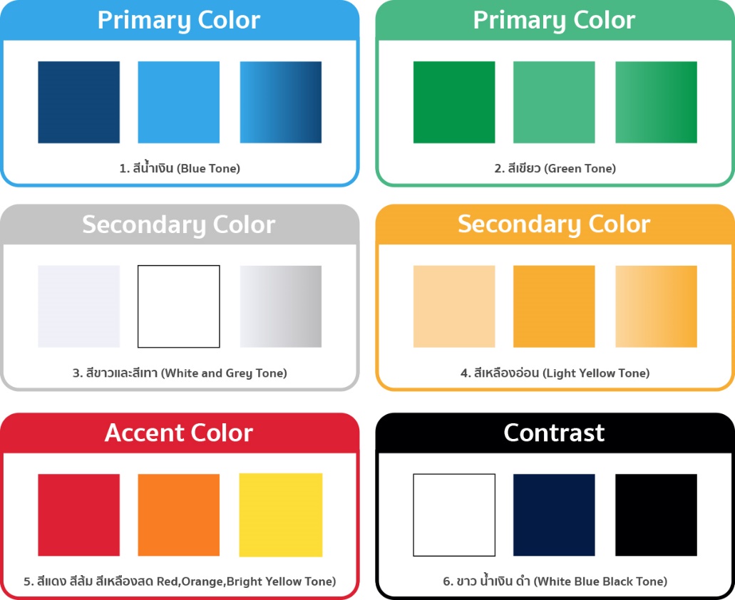
Figure 4.Application of Mood and Color Schemes in the Digital Student Handbook Interface
Figure 4 illustrates the mood and color tones employed in the digital student handbook application, guided by established mobile UI design principles. The selected primary colors—blue and green—were chosen for their psychological associations: blue conveys trust and stability, aligning well with educational contexts, while green evokes calmness and is suitable for environmental or learning-supportive themes.
Secondary colors, including white and grey, serve as background tones to enhance simplicity and text clarity. Light yellow and light orange are used to highlight important information and notifications, drawing attention to key content without overwhelming the interface.
Accent colors—such as red, orange, and bright yellow—are applied strategically to emphasize interactive elements, including buttons and alerts. Additionally, contrast is prioritized to ensure readability, utilizing pairings such as white text on dark blue or black text on white to support visual accessibility and intuitive navigation.
Step Four: Icon and Color Design Implementation
We finalized the iconography and interface elements of the digital student handbook in this stage, adhering to user-centered design principles. A book icon was selected to represent the handbook, using blue and light blue tones to maintain thematic consistency. The white font color was chosen for optimal contrast and readability, paired with a clear and simple typeface to enhance visual comfort.User preferences and prior analytical findings, as illustrated in Figure 5, informed these design decisions, reinforcing the application's usability and aesthetic coherence.
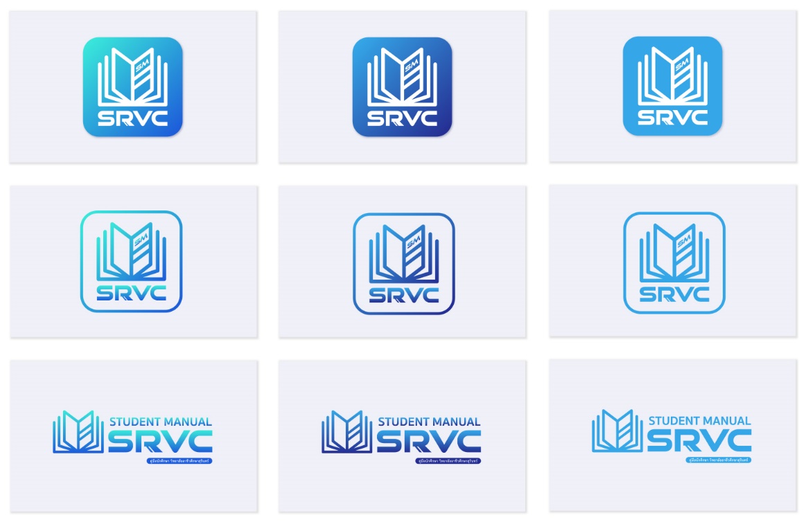
Figure 5. Icon and Color Scheme Design for the Student Handbook Application
Figure 5 illustrates the icon and color scheme design for the Student Handbook Application. The left design integrates both user preferences and data-driven insights, the middle design reflects only the target group's preferences, and the right design is based solely on key data extracted from user analysis.
Following completion of the design and development phases, the final product is a fully functional, user-friendly digital student handbook. It features a cohesive user interface (UI) and seamless user experience (UX), with visual elements—including color palette and iconography—carefully tailored to the needs and preferences of the target audience. As shown in Figure 6, the application supports intuitive navigation, aligns with modern design standards, and reinforces the vocational college’s institutional identity, thereby enhancing the overall educational experience for students.
Figure 6. Overview of the Prototype Application Interface in Figma
Design Iteration and Feedback Incorporation
The design of the digital student handbook followed a structured, iterative approach grounded in User-Centered Design (UCD) methodology. The process unfolded in three primary stages:
1. Phase 1 – UX Design: Initial Conceptualization and Sketching
Initial paper-based sketches were informed by user personas and user journey mapping, based on interview and survey data. This phase focused on identifying key functional touchpoints—such as course registration, academic planning, and student services access—and mapping them into a coherent user flow. At this stage, usability heuristics such as visibility of system status and match between system and real-world language were emphasized.
2. Digital Mockups and Refinement in Figma (Phase 2–UI Design):
Feedback from users and design experts led to revisions of layout structures, color palettes, and button styles. For instance, while early designs used flat buttons with sharp edges, user feedback indicated a preference for more tactile, rounded styles with depth. The prototype was updated accordingly in Figma, incorporating these changes and refining the spacing, alignment, and visual consistency.
3. Mood, Color, and Icon Testing:
Preferences identified through K-means clustering—such as high recall for blue-green themes—guided the final color selections. Multiple interface options were tested with users (as shown in Figure 5), and the preferred combination (leftmost design) was chosen for the final prototype. Iconography was simplified for intuitive recognition, with high-contrast colors ensuring accessibility for users with visual impairments.
4. Usability Testing and Final Adjustments:
The evolving prototypes underwent usability testing sessions with student participants. Feedback gathered on navigation ease, visual clarity, and satisfaction with content placement led to refinement in spacing, font sizing, and visual grouping of key information. Minor usability issues—such as ambiguous button labels or inconsistent icon placement—were corrected prior to final deployment.
Following the development of a digital student handbook prototype emphasizing usability and accessibility, the subsequent phase focused on evaluating its functionality, effectiveness, and user experience.
Objective 3: Evaluate Prototype Effectiveness and Identify Areas for Improvement
The third objective is to evaluate the effectiveness of the developed digital student handbook prototype by gathering user feedback through systematic testing. This evaluation aims to identify areas for improvement and to confirm that the application effectively upholds its core priorities of usability, accessibility, and cross-platform functionality. This section, therefore,centers on the evaluation of the usability and accessibility of the digital student handbook prototype, following its development with a strong emphasis on user-centered design principles. The assessment aims to determine how effectively the prototype meets the needs of its target users by offering an intuitive, accessible, and user-friendly experience.
Belowarethe results of the evaluation, drawing on data from students, staff, and experts, as detailed in Tables 3, 4, and 5. These stakeholders assessed the prototype across key areas—design quality, user experience (UX), and user interface (UI)—providing comprehensive feedback on its functional effectiveness, visual appeal, and accessibility. The findings contribute critical insights into the prototype’s performance and alignment with usability standards in educational technology.
Table 3.Student Evaluation of the Digital Student Handbook Prototype
| No | Evaluation list | N | X̄ | SD | Evaluation level | |
| 1. | Design of data and content on the application | The arrangement of data and content displayed on the application is appropriate and engaging. | 36 | 4.08 | 0.84 | Highly suitable |
| The design of data and content on the application appropriately meets the users' needs. | 36 | 4.16 | 0.84 | Highly suitable | ||
| The selection of media for managing data and content on the application is diverse and appropriate for its use. | 36 | 4.25 | 0.87 | Highly suitable | ||
| The data and content on the application are complete and comprehensive. | 36 | 4.36 | 0.93 | Highly suitable | ||
| The data and content on the application are consistent with the handbook. | 36 | 4.30 | 0.78 | Highly suitable | ||
| The grouping of related data and content is organized appropriately within the same category. | 36 | 4.25 | 0.80 | Highly suitable | ||
| Total | 4.23 | 0.75 | Highly suitable | |||
| 2. | User Experience Design (UXD) | The downloading and installation of the application are convenient. | 36 | 4.13 | 0.89 | Highly suitable |
| The application operates smoothly without any interruptions. | 36 | 4.16 | 0.91 | Highly suitable | ||
| The linking of different sections in the application is appropriate. | 36 | 4.16 | 1.0 | Highly suitable | ||
| The application is organized in a way that progresses from easier to more difficult sections. | 36 | 4.16 | 0.81 | Highly suitable | ||
| The functionality of the application is engaging, encouraging users to want to use it. | 36 | 4.22 | 0.89 | Highly suitable | ||
| The loading speed of the data pages on the application is appropriate. | 36 | 4.19 | 1.0 | Highly suitable | ||
| The overall design of the application is universal and easy to understand. | 36 | 4.11 | 0.78 | Highly suitable | ||
| The overall design of the application is convenient and easy to use. | 36 | 4.19 | 0.88 | Highly suitable | ||
| The design of the application is modern and appealing to use. | 36 | 4.36 | 0.83 | Highly suitable | ||
| Total | 4.19 | 0.76 | Highly suitable | |||
| 3 | User Interface Design (UID) | The arrangement of elements, typography, graphics, and spacing on the application screen is appropriate. | 36 | 4.13 | 0.86 | Highly suitable |
| The selection of colors, typography, and graphics is appropriate and aesthetically pleasing. | 36 | 4.25 | 0.87 | Highly suitable | ||
| The choice of font size and graphics is appropriate and aesthetically pleasing. | 36 | 4.22 | 0.86 | Highly suitable | ||
| The choice of background color and size is appropriate for the typography and functional buttons. | 36 | 4.16 | 0.91 | Highly suitable | ||
| The use of shading, depth, and embossing on buttons in a 3D style is appropriate. | 36 | 4.16 | 0.97 | Highly suitable | ||
| The design of functional buttons and form fields for data input is appropriate. | 36 | 4.27 | 0.88 | Highly suitable | ||
| The layout design is appropriate and aesthetically pleasing. | 36 | 4.19 | 0.85 | Highly suitable | ||
| The layout of content on the screen is easy to read. | 36 | 4.38 | 0.83 | Highly suitable | ||
| The language used is appropriate and easy to understand. | 36 | 4.22 | 0.95 | Highly suitable | ||
| Total | 4.22 | 0.77 | Highly suitable | |||
| Overall average | 4.21 | 0.75 | Highly suitable |
Table 3 summarizes student evaluations of the Digital Student Handbook Prototype across three dimensions: data/content design, user experience (UX), and user interface (UI). Overall, the results reveal strong user satisfaction, with consistently high mean scores across all criteria (overall mean = 4.21, SD = 0.75).
Among the three evaluation domains, design of data and content received the highest average score (M = 4.23, SD = 0.75). Students particularly valued the completeness of content (M = 4.36) and the consistency with existing handbooks (M = 4.30), suggesting that content accuracy and comprehensiveness were well executed.
UI design closely followed with a mean score of 4.22 (SD = 0.77). The clarity of the layout (M = 4.38) and the functional design of the input elements (M = 4.27) stood out as the strongest components, reflecting the effectiveness of the visual and interactive elements.
UX design, while still rated positively (M = 4.19, SD = 0.76), showed slightly lower variation. The modern appeal of the design (M = 4.36) and ease of use (M = 4.19) were frequently praised, although installation convenience (M = 4.13) and section progression logic (M = 4.16) were comparatively lower, indicating areas with modest room for improvement.
Collectively, these findings support the prototype’s alignment with student expectations, particularly in terms of layout clarity, aesthetic consistency, and functional accessibility, which are core tenets of User-Centered Design (UCD).
Table 4.Staff Evaluation of the Digital Student Handbook Prototype
| No | Evaluation Items | N | X̄ | SD | Evaluation Level | |
| 1. | Design of Data and Content on the Application | The arrangement of data and content displayed on the application is appropriate and engaging. | 55 | 4.65 | 0.61 | Most effective |
| The design of data and content on the application appropriately meets the needs of the users. | 55 | 4.52 | 0.69 | Most effective | ||
| The selection of media for managing data and content on the application is diverse and suitable for use. | 55 | 4.40 | 0.68 | Highly effective | ||
| The data and content on the application are complete and comprehensive | 55 | 4.45 | 0.53 | Highly effective | ||
| The data and content on the application are consistent with the handbook. | 55 | 4.70 | 0.45 | Most effective | ||
| The grouping of related data and content is organized appropriately within the same category. | 55 | 4.52 | 0.53 | Most effective | ||
| Total | 4.54 | 0.47 | Most effective | |||
| 2. | User Experience (UX) | The download and installation of the application are convenient. | 55 | 4.67 | 0.47 | Most effective |
| The application runs smoothly without any interruptions. | 55 | 4.50 | 0.69 | Highly effective | ||
| The linking of different sections within the application is appropriate. | 55 | 4.45 | 0.57 | Highly effective | ||
| The application is designed with a sequence that progresses from simple to more complex sections. | 55 | 4.50 | 0.79 | Highly effective | ||
| The functionality of the application is engaging, making users want to use it. | 55 | 4.50 | 0.79 | Highly effective | ||
| The loading speed of the data pages on the application is appropriate. | 55 | 4.21 | 0.87 | Highly effective | ||
| The overall design of the application is universal and easy to understand. | 55 | 4.58 | 0.68 | Most effective | ||
| The overall design of the application is convenient and easy to use. | 55 | 4.56 | 0.68 | Most effective | ||
| The design of the application is modern and attractive to use. | 55 | 4.54 | 0.50 | Most effective | ||
| Total | 4.51 | 0.56 | Most effective | |||
| 3. | User Interface: (UI) | The arrangement of elements, fonts, graphics, and spacing on the application screen is appropriate. | 55 | 4.54 | 0.63 | Most effective |
| The choice of colors, fonts, and graphics is appropriate and aesthetically pleasing. | 55 | 4.50 | 0.63 | Highly effective | ||
| The choice of font size and graphics is appropriate and visually appealing. | 55 | 4.60 | 0.62 | Most effective | ||
| The choice of background color and size is appropriate in relation to the text and functional buttons. | 55 | 4.58 | 0.56 | Most effective | ||
| The use of shadows, depth, and 3D button effects is appropriate. | 55 | 4.45 | 0.74 | Highly effective | ||
| design of functional buttons and form fields for data input is appropriate. | 55 | 4.50 | 0.71 | Highly effective | ||
| The layout of images is appropriately arranged and aesthetically pleasing. | 55 | 4.69 | 0.57 | Most effective | ||
| The placement of content on the screen is easy to read. | 55 | 4.67 | 0.57 | Most effective | ||
| The language used is appropriate and easy to understand. | 55 | 4.50 | 0.76 | Highly effective | ||
| Total | 4.56 | 0.55 | Most effective | |||
| Overall average | 4.53 | 0.49 | Most effective |
Table 4 presents the evaluation results from 55 staff members assessing the design, user experience (UX), and user interface (UI) of the Digital Student Handbook Prototype. The findings reveal consistently high ratings across all categories, indicating strong satisfaction with the application's functionality and visual design.
For data and content design, scores ranged from 4.40 to 4.70, with the highest rating (4.70) given to the item,“The data and content on the application are consistent with the handbook.”This suggests that users perceived the digital format as accurately representing the physical handbook, reinforcing its reliability as an institutional reference. The overall mean score was 4.54, classifying this domain as most effective.
For UX design, scores ranged from 4.21 to 4.67. The highest score (4.67) was for the item,“The download and installation of the application are convenient,”emphasizing ease of access and low technical barriers. The relatively lower score (4.21) may reflect more nuanced issues, possibly related to ongoing navigation or engagement, which can be improved in the next design iteration. The average UX score was 4.51, still within the most effective range.
UI design was also positively evaluated, with item scores between 4.45 and 4.69. The top-rated items—“layout of images” (4.69)and“placement of content on the screen” (4.67)—highlight user appreciation for visual clarity and well-organized information display. These results confirm that aesthetic appeal and interface logic were effectively achieved. The overall UI average was 4.56.
Interpretation:
While all categories were highly rated, slight variations point to targeted improvement areas. The consistently high UI ratings suggest visual and spatial elements were most successful, while the comparatively lower UX item score suggests the need for enhanced user engagement features. These insights support iterative design refinements focused on usability enhancements without compromising visual integrity.
In summary, the staff evaluations confirm that the prototype is highly effective, offering a well-organized, accessible, and visually appealing digital platform aligned with institutional standards and user expectations.
Table 5:Expert Evaluation of the Digital Student Handbook Prototype
| No | Evaluated Items | N | X̄ | SD | Evaluation Level | |
| 1. | The design of data and content on the application | The organization of data and content displayed on the application is appropriate and engaging. | 6 | 4.33 | 0.51 | Highly effective |
| The design of data and content on the application appropriately meets the needs of the users. | 6 | 4.00 | 0.63 | Highly effective | ||
| The selection of media for managing data and content on the application is diverse and suitable for use. | 6 | 3.83 | 0.75 | Highly effective | ||
| The data and content on the application are complete and comprehensive. | 6 | 4.00 | 0.89 | Highly effective | ||
| The data and content on the application are consistent with the manual. | 6 | 4.33 | 0.51 | Highly effective | ||
| The data and content related to each other are appropriately grouped together. | 6 | 4.17 | 0.75 | Highly effective | ||
| Total | 4.11 | 0.51 | Highly effective | |||
| 2. | The design of the user experience (User Experience: UX) | The downloading and installation of the application are convenient. | 6 | 4.50 | 0.54 | Highly effective |
| The application runs smoothly without any interruptions. | 6 | 4.33 | 0.81 | Highly effective | ||
| The linking between different sections of the application is appropriate. | 6 | 4.50 | 0.54 | Highly effective | ||
| The application is organized in a way that progresses from simple to more complex sections. | 6 | 4.50 | 0.54 | Highly effective | ||
| The functionality of the application is engaging, making users want to use it. | 6 | 4.50 | 0.83 | Highly effective | ||
| The loading speed of the data pages on the application is appropriate. | 6 | 4.67 | 0.51 | Highly effective | ||
| The overall design of the application is universal and easy to understand. | 6 | 4.83 | 0.40 | Most effective | ||
| The overall design of the application is convenient and easy to use. | 6 | 4.67 | 0.51 | Most effective | ||
| The design of the application is modern and appealing to use. | 6 | 4.50 | 0.54 | High quality | ||
| Total | 4.55 | 0.42 | Most effective | |||
| 3. | The design of the user interface (User Interface: UI) | The arrangement of elements, text, graphics, and spacing on the screen is appropriate. | 6 | 4.33 | 0.51 | Highly effective |
| The selection of colors, fonts, and graphics is appropriate and aesthetically pleasing. | 6 | 4.33 | 0.81 | Highly effective | ||
| The selection of font sizes and graphics is appropriate and visually appealing. | 6 | 4.67 | 0.51 | Highly effective | ||
| The choice of background color and size is appropriate for the text and functional buttons. | 6 | 4.67 | 0.51 | Most effective | ||
| The use of shading, depth, and 3D effects on buttons is appropriate. | 6 | 4.00 | 0.63 | Highly effective | ||
| The design of functional buttons and form fields for data entry is appropriate. | 6 | 4.33 | 0.51 | Highly effective | ||
| The layout of images is well-organized and aesthetically pleasing. | 6 | 4.67 | 0.51 | Most effective | ||
| The arrangement of content on the screen is easy to read. | 6 | 4.50 | 0.54 | Highly effective | ||
| The language used is appropriate and easy to understand. | 6 | 4.67 | 0.51 | Most effective | ||
| Total | 4.46 | 0.42 | Highly effective | |||
| Overall average | 4.40 | 0.40 | Highly effective |
Table 5 presents the evaluation conducted by six experts on the design, user experience (UX), and user interface (UI) of the Digital Student Handbook Prototype. The overall assessment rated the prototype as highly effective, with a total average score of 4.40. In the area of data and content design, scores ranged from 3.83 to 4.33, with high marks for organization and consistency, though media diversity received the lowest score (3.83), indicating room for improvement. UX design was rated particularly strong, with scores between 4.33 and 4.83, and the highest score (4.83) was awarded for the prototype’s universality and ease of understanding. Features such as smooth operation and functional engagement also received favorable evaluations (approximately 4.50). For UI design, scores ranged from 4.33 to 4.67, with positive feedback on layout, color usage, and image arrangement. However, the 3D button effects received a slightly lower score (4.00), suggesting an area for visual refinement. Overall, expert feedback affirms the prototype's strong performance while identifying minor opportunities for improvement in visual and media elements.
Discussion
In higher education, the shift from traditional paper-based student handbooks to digital platforms reflects a broader movetoward student-centric service design and digital transformation. Paper handbooks, while historically important, pose well-documented limitations—including static content, limited portability, and inefficiency in content updates (Ait Ounejjar et al., 2024; Armour et al., 2025). These limitationsaffect access and reducethe utility of the handbook as a real-time academic support tool, particularly in a post-pandemic context where remote and hybrid learning dominate.
Although digital handbooks promise greater accessibility and efficiency, this study confirms that many current implementations remain functionally inadequate. Prior studies note similar issues, such as poor usability, inconsistent navigation, and a lack of adaptive content (Armour et al., 2025; Soehnchen et al., 2024). The present findings reinforce these critiques, particularly the persistent lack of personalization and failure to meet WCAG standards—an exclusionary flaw that marginalizes students with disabilities (Zakir & Imtiaz, 2024; Zhao et al., 2024). This aligns with existing research that critiques edtech solutions for insufficiently addressing diversity and inclusivity in design (Jameson et al., 2022).
By employing user-centered design (UCD) principles, this study addressed many of these shortcomings. The developed prototype was evaluated positively across all stakeholder groups, with students highlighting usability (M = 4.36) and interface appeal, while staff and experts affirmed its institutional alignment and technical accessibility. These results resonate with findings from Carreiro et al. (2024), who emphasized the value of participatory design and aesthetic customization in enhancing user engagement in educational platforms. The use of data clustering to inform design choices represents a methodological innovation, as it directly translates user preferences into interface aesthetics, supporting research advocating for data-driven personalization in education technology (Carreiro et al., 2024).
However, the discussion must go beyond positive feedback. Expert criticisms regarding limited media diversity and flat visual hierarchy (e.g., underwhelming 3D button effects) suggest that aesthetic appeal and functionality must be balanced more carefully. These shortcomings reflect broader tensions in UCD implementation: while the model centers user needs, it often prioritizes average or majority use cases, potentially neglecting edge cases or advanced visual users. Thus, future iterations must incorporate broader testing scenarios, including those that simulatethe needs of low-vision users, neurodiverse learners, and multilingual individuals.
The study's contribution lies not only in validating the effectiveness of UCD in the development of educational tools but also in expanding the methodological discourse. By integrating user testing, quantitative feedback, and expert review in an iterative cycle, the research demonstrates that UCD is not a linear design path but a dynamic, participatory negotiation between diverse user groups. Moreover, the inclusion of analytics-driven customization (e.g., K-means clustering)presents a novel intersection between UX design and data science in the higher education context—a domain that isstill underrepresented in digital education research.
Ultimately, this study suggests that UCD should be repositioned not merely as a usability enhancement strategy but as a critical framework for digital equity, student empowerment, and institutional adaptability. By treating digital student handbooks as evolving service systems rather than static content repositories, higher education institutions can better align technological interventions with learner diversity, regulatory standards, and pedagogical goals.
Conclusion
This study was guided by three core objectives: (1) to critically assess the limitations of traditional paper-based student handbooks and existing digital alternatives in higher education; (2) to develop a user-centered digital student handbook prototype that prioritizes usability and accessibility; and (3) to evaluate the effectiveness of the prototype in meeting the identified needs.
In response to the first objective, the study found that both traditional and current digital handbooks suffer from significant shortcomings. These include limited accessibility, outdated content, fragmented navigation, poor device compatibility, and insufficient support for assistive technologies—factors that collectively hinder students’ ability to access and engage with essential academic information.
We fulfilled the second objective by developing a digital student handbook prototype based on user-centered design (UCD) principles to address these challenges. Drawing on insights from student surveys, interface evaluations, and visual preference analyses, the prototype emphasized intuitive navigation, a responsive layout, cohesive design elements, and interactive content delivery.We directly incorporated key user preferences, like clear academic program information and accessible student services, into the design.
A multi-stakeholder evaluation involving students, institutional staff, and UI/UX experts achieved the third objective. Feedback affirmed the prototype’s usability, content clarity, and accessibility, while also identifying areas for minor improvements, such as expanded media types and aesthetic refinements. Overall, the evaluations validated the prototype’s potential as an inclusive and engaging digital solution.
This study contributes to academic knowledge by offering an empirically grounded model for designing accessible digital tools in higher education, guided by user-centered design methodology. Practically, it provides a scalable framework for institutions seeking to modernize student support systems while ensuring accessibility, user satisfaction, and integration with institutional infrastructure. Future research may build on this foundation to explore long-term adoption, performance analytics, and integration with AI-driven personalization tools.
This study advances the discourse on digital transformation in higher education by demonstrating how user-centered design (UCD) principles can be effectively applied to the development of inclusive, responsive, and accessible digital student handbooks. Through a structured approach encompassing needs analysis, iterative prototyping, and multi-stakeholder evaluation, the research highlights critical shortcomings in existing handbook formats—both paper-based and digital—and offers a validated alternative grounded in actual user expectations.
Theoretically, the findings reinforce the value of participatory and data-informed design frameworks in educational technology development. By integrating tools such as K-means clustering to capture user preferences and applying iterative usability feedback, the study contributes a methodological model that bridges UX research and educational service design. It also emphasizes the ethical imperative of accessibility, positioning UCD not only as a technical strategy butalsoas a pathway toward digital equity in institutional communication and resource delivery.
From a policy and practice standpoint, the digital student handbook prototype presents a scalable, customizable tool for universities aiming to modernize academic support systems. The study’s outcomes offer concrete guidelines for institutional stakeholders: prioritize accessibility standards (e.g., WCAG compliance), implement responsive multi-platform designs, and ensure alignment between digital resources and core academic services. Furthermore, the inclusion of student-driven content and visual customization features may enhance institutional engagement and promote inclusive academic environments.
Future work should explore the long-term effectiveness of such tools, focusing on adoption metrics, integration with learning management systems, and the potential for AI-driven personalization to support individualized student journeys. As higher education continues to navigate digital transformation, this study provides a replicable foundation for designing student-centered systems that are both technologically robust and pedagogically meaningful.
Recommendations
To strengthen the effectiveness and inclusivity of the digital student handbook, the study recommends prioritizing two key areas in future development: personalization and accessibility compliance. Incorporating personalized features—such as academic progress tracking, tailored course suggestions, and targeted notifications—would enhance the handbook’s relevance and usability by aligning the platform with individual student needs and promoting moremeaningful engagement. Additionally, full adherence to the Web Content Accessibility Guidelines (WCAG) is essential for ensuring equitable access. Such compliance includes compatibility with assistive technologies (e.g., screen readers) and the use of accessible visual elements such as scalable fonts, high-contrast color schemes, and intuitive navigation. Together, these enhancements would ensure that the digital student handbook serves as an adaptive, inclusive, and user-centered tool within diverse higher education settings.
Limitations
This study acknowledges two primary limitations that may affect the generalizability and inclusivity of its findings. First, while accessibility was a central design objective, the evaluation did not include comprehensive usability testing with students who use assistive technologies (e.g., screen readers or alternative input devices). Consequently, the prototype may not fully address the needs of users with diverse disabilities or varying levels of technological proficiency, limiting its real-world inclusiveness.
Second, the scope of personalization features assessed was limited. Although user preferences informed content and interface design, the study did not evaluate the long-term functionality of adaptive elements such as personalized notifications, course recommendations, or academic progress tracking. Moreover, the prototype was tested within a single institutional context, which may not capture the broader diversity of academic systems and user expectations. Broader, multi-institutional testing is needed to assess the scalability and effectiveness of personalized features across varied educational environments.
Ethics Statements
This study was approved byMahasarakham University ethics committee.
We all appreciate Mahasarakham University support.
Conflict of Interest
The authors declarethat they haveno conflicts ofinterest.
Funding
This studyis financially supported for publication byMahasarakham University.
Generative AI Statement
As the authors of this work, weutilized the AI tool ChatGPT and Quillbot for grammar checking. After using this AI tool, we reviewed and verified the final version of our work. We, as the authors, take full responsibility for the content of our published work.
Sangsuwan: Conceptualization, research design, data collection and analysis, and manuscript drafting. Saithong: Conceptualization, research design, manuscript revision, technical supervision of data collection and analysis, critical manuscript revision, and final review. Polpinij: Interpretation of analysis results and critical manuscript revision.